Difference between revisions of "Gnuplot"
imported>ThorstenStaerk |
m |
||
| (22 intermediate revisions by 2 users not shown) | |||
| Line 1: | Line 1: | ||
| + | = OverView = | ||
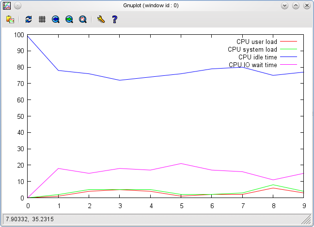
Here is an example how to visualize [[vmstat]]'s output using gnuplot. | Here is an example how to visualize [[vmstat]]'s output using gnuplot. | ||
| + | <pre> | ||
vmstat 1 10 | grep -v r > vmstat.txt | vmstat 1 10 | grep -v r > vmstat.txt | ||
gnuplot -p -e "plot 'vmstat.txt' using 13 title 'CPU user load' with lines, 'vmstat.txt' using 14 title 'CPU system load' with lines, \ | gnuplot -p -e "plot 'vmstat.txt' using 13 title 'CPU user load' with lines, 'vmstat.txt' using 14 title 'CPU system load' with lines, \ | ||
'vmstat.txt' using 15 title 'CPU idle time' with lines, 'vmstat.txt' using 16 title 'CPU IO wait time' with lines" | 'vmstat.txt' using 15 title 'CPU idle time' with lines, 'vmstat.txt' using 16 title 'CPU IO wait time' with lines" | ||
| + | </pre> | ||
The result will look like this: | The result will look like this: | ||
[[Image:Snapshot-gnuplot.png]] | [[Image:Snapshot-gnuplot.png]] | ||
| + | |||
| + | = xy diagrams = | ||
| + | |||
| + | == lines == | ||
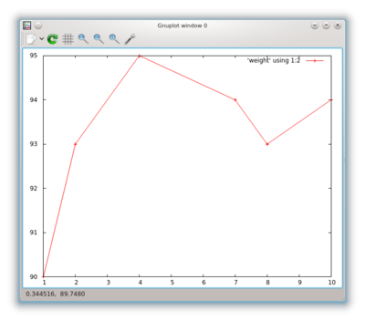
| + | Maybe you do not have data for every x value. Let's say you want to plot your weight and have measured your weight on monday, tuesday and friday, but not on wednesday and thursday. In this case you must tell gnuplot as well the X as the Y coordinate of every measurement. You want a graph like this: | ||
| + | |||
| + | [[File:snapshot-gnuplot-weight.png|400px]] | ||
| + | |||
| + | The above has been taken with the command | ||
| + | <pre> | ||
| + | gnuplot -p -e "plot 'weight' using 1:2 with linespoints" | ||
| + | </pre> | ||
| + | and the data in the file weight: | ||
| + | <pre> | ||
| + | 1 90 | ||
| + | 2 93 | ||
| + | 4 95 | ||
| + | 7 94 | ||
| + | 8 93 | ||
| + | 10 94 | ||
| + | </pre> | ||
| + | |||
| + | == bars == | ||
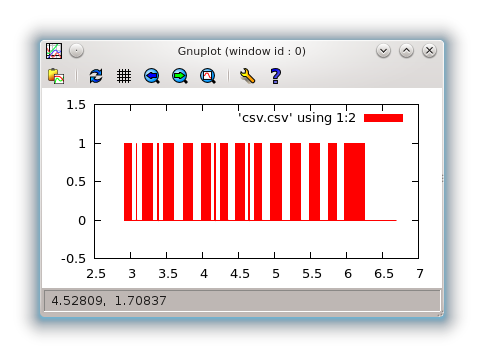
| + | Or maybe you get data from your serial port showing voltage levels for transmitting characters as to be seen on [http://en.wikipedia.org/wiki/RS-232#Voltage_levels wikipedia]. In this case you want a chart with bars like this: | ||
| + | |||
| + | [[File:Snapshot-gnuplot-bars-wxt.png]] | ||
| + | |||
| + | It has been drawn with the command | ||
| + | <pre> | ||
| + | gnuplot -p -e "set terminal wxt size 400,200; set yrange[-0.5:1.5]; set style fill solid; plot 'csv.csv' using 1:2 with boxes" | ||
| + | </pre> | ||
| + | |||
| + | on the data in csv.csv (time vs bit level): | ||
| + | <pre> | ||
| + | 2.919770956 1 | ||
| + | 2.9377708435 0 | ||
| + | 2.9438738823 1 | ||
| + | 3.0778059959 0 | ||
| + | 3.0837988854 1 | ||
| + | 3.0907878876 0 | ||
| + | [...] | ||
| + | </pre> | ||
| + | |||
| + | = Output to a file = | ||
| + | To save your output as a .png file, set output and terminal: | ||
| + | gnuplot -p -e "plot 'datasource.txt' using 4 with lines;set output 'test.png';set terminal png;replot" | ||
| + | |||
| + | |||
| + | = TroubleShooting = | ||
| + | If you get an error message like | ||
| + | |||
| + | gnuplot -p -e "plot 'data.txt' with lines" | ||
| + | Cannot open load file '-p' | ||
| + | line 0: util.c: No such file or directory | ||
| + | |||
| + | You are most probably on an outdated gnuplot version. Version 4.4 differs a lot from 4.2. | ||
| + | |||
| + | = See also = | ||
| + | * [[ksar]] | ||
| + | * [[dot]] : Create graphics using text commands | ||
| + | |||
| + | [[Category:Graphics]] | ||
| + | [[Category:Tool]] | ||
Latest revision as of 20:07, 2 August 2023
Contents
OverView
Here is an example how to visualize vmstat's output using gnuplot.
 vmstat 1 10 | grep -v r > vmstat.txt
 gnuplot -p -e "plot 'vmstat.txt' using 13 title 'CPU user load' with lines, 'vmstat.txt' using 14 title 'CPU system load' with lines, \
 'vmstat.txt' using 15 title 'CPU idle time' with lines, 'vmstat.txt' using 16 title 'CPU IO wait time' with lines"
The result will look like this:
xy diagrams
lines
Maybe you do not have data for every x value. Let's say you want to plot your weight and have measured your weight on monday, tuesday and friday, but not on wednesday and thursday. In this case you must tell gnuplot as well the X as the Y coordinate of every measurement. You want a graph like this:
The above has been taken with the command
gnuplot -p -e "plot 'weight' using 1:2 with linespoints"
and the data in the file weight:
 1 90
 2 93
 4 95
 7 94
 8 93
 10 94
bars
Or maybe you get data from your serial port showing voltage levels for transmitting characters as to be seen on wikipedia. In this case you want a chart with bars like this:
It has been drawn with the command
gnuplot -p -e "set terminal wxt size 400,200; set yrange[-0.5:1.5]; set style fill solid; plot 'csv.csv' using 1:2 with boxes"
on the data in csv.csv (time vs bit level):
 2.919770956 1
 2.9377708435 0
 2.9438738823 1
 3.0778059959 0
 3.0837988854 1
 3.0907878876 0
 [...]
Output to a file
To save your output as a .png file, set output and terminal:
gnuplot -p -e "plot 'datasource.txt' using 4 with lines;set output 'test.png';set terminal png;replot"
TroubleShooting
If you get an error message like
gnuplot -p -e "plot 'data.txt' with lines"
Cannot open load file '-p'
line 0: util.c: No such file or directory
You are most probably on an outdated gnuplot version. Version 4.4 differs a lot from 4.2.


